
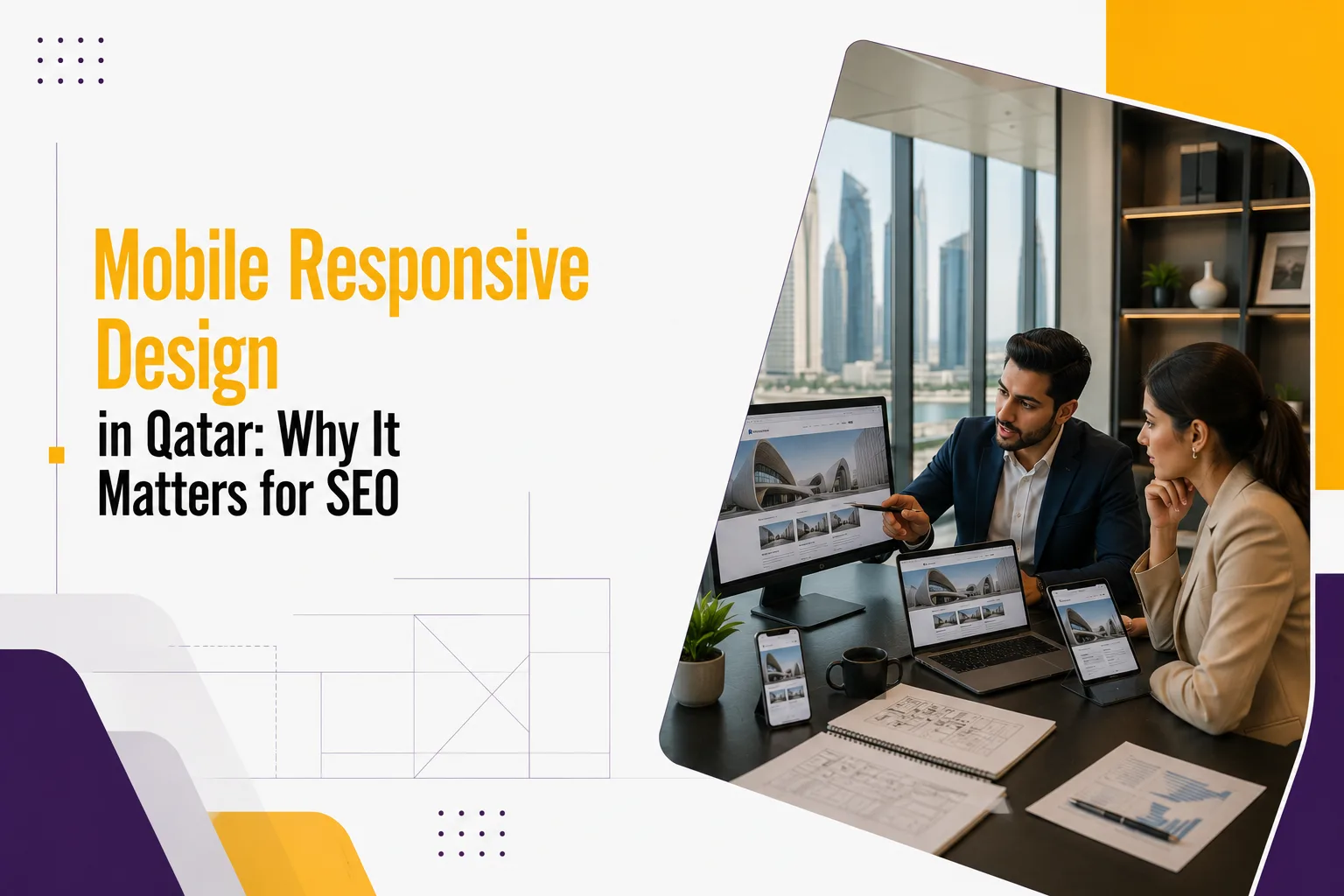
For every business, launching a website is a significant step. This is your online store, your sales representative, and sometimes the initial point of contact between your brand and potential clients. Nevertheless, if your website doesn’t work effectively on mobile devices, it will not provide you with the desired outcomes, regardless of how lovely it appears on desktop.
Just look at how people search the web today. If you are a business owner going to Doha for a meeting, you may want to look for a web development company. One customer could be browsing from a café while comparing the service providers, and the other could be searching for solutions from the comfort of their home. Almost always, the journey begins on a smartphone. Visitors are unlikely to stick around if your website is sluggish, unattractive, or difficult to use. Rather, they will return to the search results and select a rival that provides a superior online experience.
Google is taking a close look at this behavior. Today, mobile responsiveness is an essential part of web development and SEO, as the search algorithm now ranks the mobile version of websites higher in its search results. A responsive web design not only engages the visitors, but also boosts the search visibility, builds trust and increases the chances of converting visitors into customers.
Knowing the definition of responsive design is essential for the development of a website that functions effectively in the present and will continue to function effectively as technology evolves. This is particularly true if you are considering a redesign or launching a new business website.
What is a mobile responsive design?
A web development method called mobile responsive design enables a website to dynamically modify its style and content according to the screen size. A responsive website is one that works uniformly across smartphones, tablets, laptops, and desktop PCs rather than having separate webpages for desktop and mobile devices.
A website’s ability to function on a smaller screen is not its sole goal. To allow people to browse comfortably on any device, a responsive design constantly updates navigation, resizes pictures, adapts content, and optimizes site structure. Someone reading an article, someone using services, and someone filling out a contact form all these functions should feel natural.
Let us suppose you are using your smartphone to browse two distinct company websites. The menu is hard to browse, the buttons are too small to press accurately, and the text is so small that you have to zoom in to read it. The other is perfect, as it is easy to browse, has clear language, and quickly reaches the important information. It feels like a professional experience and is effortless to use, and most people will trust the second business almost immediately.
Responsive design is also beneficial for businesses behind the scenes. It is easier to update, there is only one site to maintain, maintenance costs are cheaper, and there is new content regularly on devices. Smartphones and screen sizes are constantly changing, and a responsive website can respond to them without needing a total redesign.
Why Mobile Users Are Harder to Please Than Ever
People’s Internet browsing habits have changed drastically over the last decade. From being basic communication tools, smartphones have developed into the main tools for product research, business comparison, service booking, and purchasing decisions.
Users want websites to work on mobile as well as they work on desktop. They do not wait to see whether the experience improves because of sluggish loading times, hard navigation or hard to see information. Instead, they’ll visit another site that provides the information they’re looking for quicker.
This is particularly the case in Qatar, which has one of the highest rates of mobile phone penetration in the area. When people are looking for a firm, either a local grocer, a restaurant, or a professional service, they’re typically in a hurry. Companies that can deliver a seamless mobile experience will be in a better position to capitalize on these prospects.
Mobile users also tend to have higher intent. People on their phones are often ready to do something whether that’s call a business, ask for a quote, book an appointment or buy something. A responsive website lowers the barriers that make these actions easy and fast. And that increases the chances that visitors will become customers.
In summary, responsive design is not about following trends. It is about fulfilling client expectations and making it simple for them to interact with your company from wherever.
How Google’s Mobile-First Indexing Operates
One of the biggest developments in modern SEO is Google’s move to mobile-first indexing. It’s a technical-sounding phrase, but the concept is simple. Google first checks the mobile version of your site, not the desktop version, to decide your pages’ search rankings.
The way people utilize the internet now is reflected in that. Since the majority of searches are conducted on mobile devices, Google aims to suggest websites that provide a positive mobile user experience.
Google looks at a lot of things regarding your mobile site. Loading speed is one of the most important factors. Users anticipate quick site loads. Navigation should be simple and intuitive, so visitors can move between pages without getting lost. Readability matters too; the text must be easy to read, and the layout should not necessitate constant zooming or horizontal scrolling.
Google also looks at visual stability. Images and buttons and other elements on a page jumping around when a website is loading is annoying and destroys the user experience. These technical things may seem trivial but they all add up to the way your site is viewed by both visitors and search engines.
All too frequently, businesses prioritize content above technological aspects. Yet even the best content can struggle to rank if visitors are not greeted with a positive mobile experience. When you invest in responsive design, you’re creating a website that is friendlier to visitors and easier for search engines to evaluate.
How Mobile Responsive Design and SEO Complement Each Other
When people think of SEO, they think backlinks, keywords and content generation. These are still very important but now technical website performance is just as important. Such an approach can help to cover multiple ranking factors at once, making it one of the strongest bases for long-term SEO success.
Provides an exceptional user experience
A website that is successful is consistently user-centric. People want to find information quickly, not get lost in a confusing layout or broken functionality. Responsive design does this job by presenting content in a clean and structured way that adapts to all screen sizes seamlessly.
For example, if someone is looking for your web development services, visitors should be able to easily understand what you have to offer, browse your portfolio, and contact your team without having to struggle with the navigation of the website. Making the experience effortless results in visitors staying longer and viewing more pages.
These positive interactions give Google valuable signals. User experience is not the only criterion that matters in rankings, but more engaging websites rank better since they better satisfy user expectations.
Makes your website faster
One of the most important factors for both user experience and SEO is website speed. Users expect web pages to load in a matter of seconds, particularly on mobile devices. A slow-loading website can be a frustrating experience for users who leave the page before they even get a chance to see your content.
Speed is often a factor while creating responsive webpages. Developers shrink pictures, eliminate unnecessary code, and employ layouts that perform well, all of which contribute to speedier page loading across different devices and internet connections. The upgrades make for a better browsing experience and demonstrate Google’s dedication to speedy, high-quality websites.
Additionally, a website that loads quickly creates a better first impression. Visitors are more likely to stay and explore your site instead of returning to the search results, as it shows you value their time.
Reduces Bounce Rates
A high bounce rate means visitors aren’t getting the experience they expected. There are many reasons someone might leave a website, but poor mobile usability is one of the most common.
What if you click on a search result and you land on a page with unreadable text, broken buttons, or an ugly layout on your phone? Most users won’t spend time figuring out how to navigate the site; they will just leave and pick another option.
Responsive design addresses this issue by ensuring that your website is easy to navigate the minute visitors land on it. Easy navigation, legible content, and decent-sized buttons keep users engaged for longer and make them visit more pages. Bounce rate isn’t a direct ranking factor, yet better engagement does tend to correlate with improved SEO performance over time.
Crawling and Indexing Enabled
Search engines need to understand your site to rank it correctly. That’s where responsive design comes in to save the day, offering you one website that works across multiple devices.
Many companies had separate desktop and mobile websites. This often led to duplicate content, inconsistent updates, and technical SEO issues. Responsive design is controlled from one website, which makes it easier for Google to crawl and index your page.
This makes technical SEO easier and maintenance less of a headache, which means visitors receive the same high-quality content, regardless of the device they’re using.
Boosts Local SEO
Local search is playing a major role in pulling customers to businesses in Qatar. These searches are often happening on a smartphone and often lead to a quick action, whether they are looking for a restaurant, a retail store or a web development agency.
A mobile-friendly website makes it easier for users to call your business, get directions, fill out inquiry forms, or browse your services without frustration. And these happy experiences are part of the reason why responsive websites generally rank better in local search when paired with good local SEO practices. According to Google.
Responsive design is not only about a better ranking. It’s all about making the most of each visitor that lands on your business online.
Responsive Design Establishes Trust
Your website is often the first impression customers get of your business. Through their experience on your website, they decide if your business looks credible before they talk to your team or inquire about your services.
Responsive sites instantly build trust. Pages load fast, navigation is intuitive and information is easy to find, visitors are more likely to trust your brand. On the other hand, a broken, slow-loading or difficult-to-navigate website can make a reputable business seem out of date.
Consider your website as your digital store. A clean and well-organized website is a sign that you are a professional and care about the experience of the visitor. That positive first impression often has them digging deeper into what you offer and eventually taking action.
Signs Your Website Is Not Mobile-Friendly
Many organizations assume they have a mobile-friendly website because it opens on a mobile phone. But real responsiveness is more than simply appearing beautiful on a smaller screen. The whole experience should be smooth, readable, and easy to navigate.
Typical warning signs are text that is too small to read, buttons that are hard to tap, images that don’t scale properly or pages that load slowly on mobile networks. When utilizing smaller devices, visitors may also struggle with lengthy forms or complicated choices.
It is essential to test your website’s mobile speed if users are abandoning it rapidly or if you are getting comments about usability problems. Frequent cross-device testing helps identify these problems before they affect SEO and customer experience.
Avoid These Common Mobile Design Mistakes
You don’t make a responsive website by squashing a desktop layout. Design this thoughtfully, with mobile users in mind.
Adding too many visuals is one of the biggest mistakes a business can make as it slows down the page speed. Big banners, pointless animations and large images may look good but they often affect performance, especially for people on mobile data.
A common problem is overloading a page with information. Mobile users want clear headings, shorter paragraphs and enough room to read without feeling overwhelmed.
Navigation takes thought, too. Unnecessary frustration comes from complicated menus, tiny buttons and long forms. Instead, think simple navigation, touch-friendly buttons and simplified forms to help users get stuff done.
Companies can provide a much better experience that keeps visitors engaged and staying around longer, by avoiding these common mistakes.
Website SEO Tips That Work Alongside Responsive Design
Responsive design is the technical foundation, but there are a few things that work in tandem to bring SEO success. Having a good website with good content is far more likely to rank well in search results.
The first step is to create content that answers your audience’s questions. Search engines like useful, well-structured information on a site, not content written just to include keywords. Clear headings, page layout, and page titles help users and search engines understand your content.
And it’s also critical to assess website performance regularly. Optimizing images, improving page speed, securing your website with HTTPS and adding relevant internal links all contribute to a better user experience and stronger SEO. But each one of these website SEO tips can make a difference in the overall experience of your website, and how easy it is to find, navigate, and trust.
Web Design Best Practices for Long-Term Success
Good web design is not about following every new trend. It’s about building a website that is easy to use today and has the flexibility to evolve with future needs.
Putting users first is one of the most important web design best practices. Every page should have a clear purpose, consistent branding, readable typography, and straightforward navigation. Visitors should not have to wonder what to click or hunt for vital information.
Accessibility is another important consideration. A website with legible fonts, sufficient color contrast, descriptive image text and mobile-friendly navigation can be used by a larger audience. Regular testing is just as important as browsers, devices, and user expectations continue to evolve. A series of small improvements over time will help to keep your website performing well long after it launches.
The Importance of Mobile Responsive Design for Qatar Businesses
In Qatar, businesses operate in a highly connected and competitive digital environment. Customers’ journeys usually begin with an online search, whether they are looking for professional services, retail stores, restaurants, or technology solutions.
A responsive website helps businesses capitalize on these opportunities. Businesses can build a seamless experience, enticing visitors to linger, explore services, and connect, rather than losing potential customers to slow load times or poor usability.
Responsive design also enhances the return on investment of digital marketing campaigns. Whether guests come from SEO, paid advertising, or social media, they are more likely to convert if the website performs well on all devices. Responsive design is not a luxury for businesses with long-term online growth in mind.
Final Thoughts
A winning website does more than look good. It needs to deliver an experience that aids visitors in quickly finding information, interacting with your business with ease and feeling confident in your brand.
This is why mobile responsive design is such an important aspect of modern web development. It improves the user experience, increases SEO performance, simplifies website management, and helps businesses connect with customers on their preferred devices.
If you are building a new website or revamping an existing site, one of the best decisions you can make is to invest in responsive design from the start. When combined with practical website SEO tips, a truly mobile-friendly website, and proven web design best practices, it creates a strong foundation for long-term online success.
Grow Your Business with Mobile-Responsive Website Solutions
Boost SEO, improve user experience, and increase conversions with a mobile-responsive website built for your business.
Frequently Asked Questions
What is the difference between a mobile-friendly website and a mobile responsive design?
Although the two terms are often used interchangeably, they describe different approaches. A mobile-friendly website is designed to work on smartphones, but it may simply display a smaller version of the desktop site. A responsive website takes this further by automatically adjusting its layout, images, navigation, and content to fit any screen size.
This creates a more consistent experience across smartphones, tablets, laptops, and desktops. Responsive design also makes website management easier because businesses only need to maintain one version of their site. For companies planning long-term growth, responsive design offers greater flexibility, better usability, and stronger SEO benefits.
How does mobile responsive design improve SEO?
Responsive design supports SEO by improving several factors that search engines consider when ranking websites. It enhances page speed, provides a better user experience, reduces usability issues, and makes it easier for Google to crawl and index your content.
Since Google uses mobile-first indexing, the mobile version of your website plays a major role in determining search rankings. A responsive website ensures visitors can browse comfortably on any device, encouraging them to stay longer and explore more pages. While responsive design isn’t the only ranking factor, it provides a strong technical foundation that supports every other aspect of your SEO strategy.
Is responsive design necessary if my audience mainly uses desktop computers?
Yes. Even if many of your customers complete their purchases or inquiries on a desktop, they often begin their research on a mobile device. A poor mobile experience can cause potential customers to leave before they ever reach the desktop stage.
Search engines also evaluate your website from a mobile perspective, meaning mobile performance affects your visibility regardless of how your audience eventually converts. Investing in responsive design ensures your website delivers a consistent experience across every device while preparing your business for future changes in user behavior.
How can I tell if my website is responsive?
The simplest way is to test your website on multiple devices, including smartphones, tablets, laptops, and desktop computers. Check whether pages load quickly, text remains readable without zooming, images display correctly, and navigation works smoothly.
You should also test contact forms, clickable phone numbers, and menus to make sure users can complete important actions without difficulty. Tools such as Google’s PageSpeed Insights can provide additional recommendations for improving mobile performance. Regular testing helps identify issues early and ensures your website continues to meet modern usability standards.
Why should businesses in Qatar invest in responsive web development?
With smartphone usage continuing to grow across Qatar, customers expect businesses to provide a seamless mobile experience. Whether they’re searching for services, comparing providers, or making purchasing decisions, a responsive website makes it easier for them to interact with your business.
Beyond improving user experience, responsive web development strengthens SEO, increases credibility, and supports higher conversion rates. It also ensures your website remains adaptable as technology evolves. For businesses looking to build a strong digital presence and compete effectively online, responsive design is no longer optional but an essential part of long-term success.